HowIhelpyou.
My primary purpose is to make sure your marketing lives up to your expectations.
Execute Marketing Ltd
Central Office
Cobweb Buildings
The Lane
Lyford, Oxfordshire
OX12 0EE
I am a strategic and hands-on marketer who plans and delivers marketing activities to grow my clients’ businesses. My skills cover online and offline marketing and my experience spans large corporates through to smaller and medium-sized businesses. I have a first class degree in marketing and post graduate diploma from the Chartered Institute of Marketing. After over 20 years of hands-on marketing I’ve learned which activities are successful and how they should be executed.
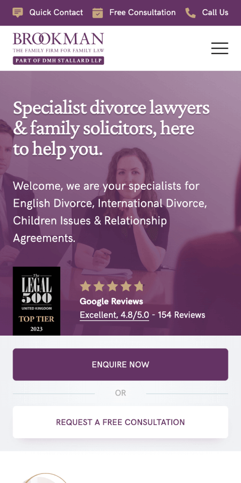
Brookman is one of the UK's most highly regarded family law teams, with offices in London and across the south east. The team of over 20 specialists, has many who are ranked by The Legal 500 and Chambers & Partners.

JCF is one of London's leading property management companies, responsible for over 200 separate properties ranging from commercial units to large apartment blocks, amounting to several thousand units in total.
My primary purpose is to make sure your marketing lives up to your expectations.
You will no longer have to second-guess which marketing activities are working and which are failing. I identify and remove the underperforming activities, recommend new activities appropriate to your business and optimise them for greater returns. You then gain a clear marketing direction with correctly executed activities which are measured against results.
The way marketing should be.
If you are concerned about how to grow your business through marketing, contact me for a free chat. No pressure and no obligation.